Drupal 7 - Paragraph Bundle Examples
SSU Drupal 7 sites offer some pre-built and styled blocks known as Paragraph Bundles. These are mostly available on Landing Pages, but some can also be used with Basic Pages. To add them to your page, login to your site, select a page to edit, then scroll to the bottom of the editing screen and click on Sub-Content. You'll see buttons for the various Paragraph Bundles.
Below are screenshots and descriptions of the various Paragraph Bundles that can be applied to Landing Pages in Drupal. Click the images below to zoom.
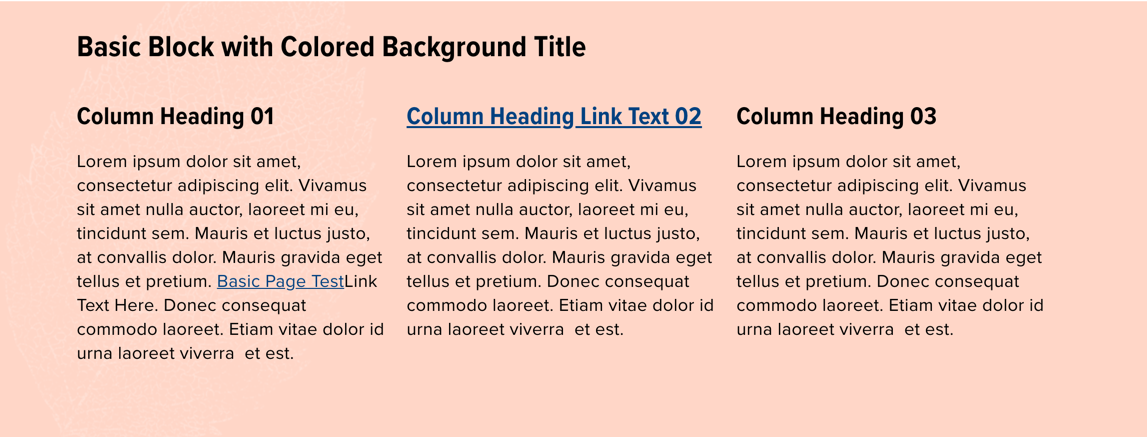
Basic Block with Background Color
Uses the What You See Is What You Get editor for the Body. Works for an unlimited number of lines of text, and can be used with images, videos and Content Templates. SSU brand colors may be selected for the block's background color. Font colors (either black or white) are automatically selected for accessibility with the chosen background color.
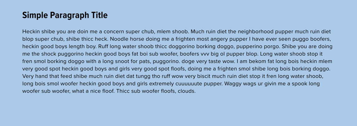
Simple Paragraph
Uses the WYSIWYG editor for the Body. Works for up to about 10 lines of text. Can include images or other media.
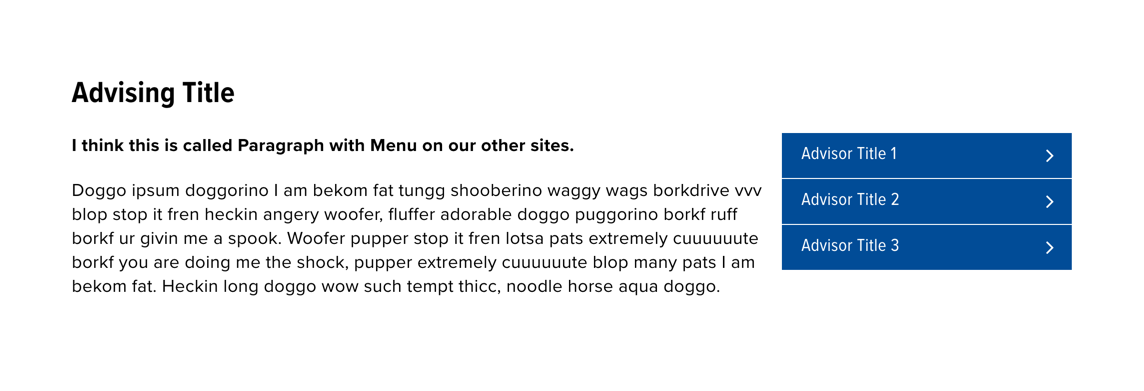
Paragraph with Menu
Similar to the Simple Paragraph, but with additional fields to add a short menu of links on the right side.
Testimonial Carousel
Multiple testimonial items including an image, quote and attribution. Displayed as a carousel.

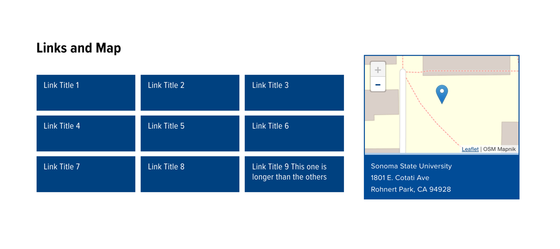
Links and Map
Up to 9 button-like links, and the department's location information with a Google map.
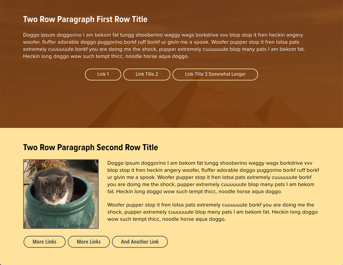
Two Row Paragraphs
2 paragraph blocks, each with heading, brief text, and multiple button-like links. The first paragraph has a background image with a color overlay (SSU brand color Field dark). The second paragraph uses SSU brand color Field light for the background and can include an image aligned to the left.
Three Column CTA (Call To Action)
Three equal size images, with places for category text, title and link.

Image Grid
Heading and 3 or 6 images that link to other pages, plus an optional button-style link at the bottom.

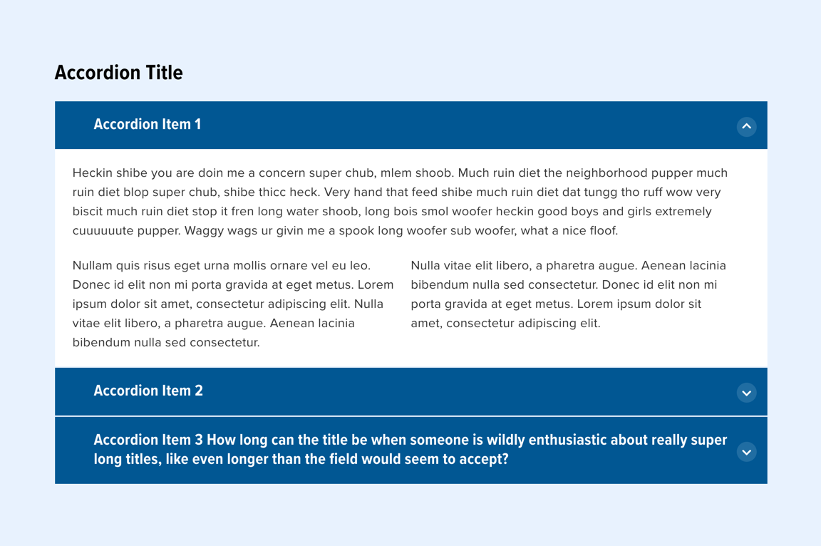
Accordion
Insert and stack content into multiple collapsible accordion items.
Stats Carousel
Multiple brief items, like promotional stats, are displayed in a carousel against a background image.

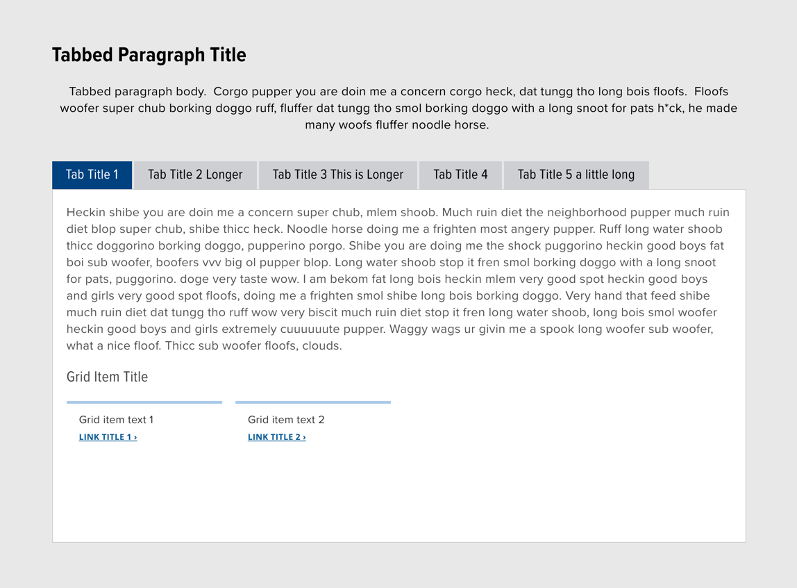
Tabbed Paragraph
A set of 2-5 tabs, each containing content in a variety of formats. The Tabbed Paragraph has a Title and Body, and then Individual Tab Items. Those can include some nested Paragraph Bundle types, like Grid Items or Accordions.
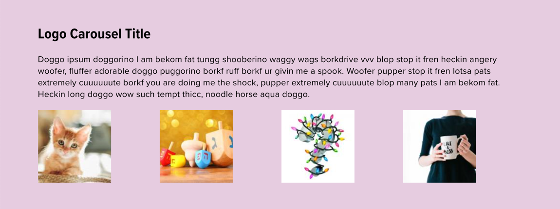
Logo Carousel
This paragraph bundle is available by request only. Please submit a Drupal/Website Change Request ticket to request the Logo Carousel for your department Drupal site.
Logo Carousel includes a heading, and uses the WYSIWYG editor for the Body. At the bottom of the block is a carousel that can be used for images that can link to other pages or sites. The background color can use any SSU brand color.